Trendlines are an important, and easy way to see what a stock is doing, as well as where good entry and exit points might be. Like all indicators, trendlines give us another clue as to where a stock may be headed, or where it might run into trouble.
They’re usually pretty easy to spot and aren’t difficult to draw into your charts. You really only need two points to connect, though the more points that connect the line, the better/stronger the trendline is.
Uptrend
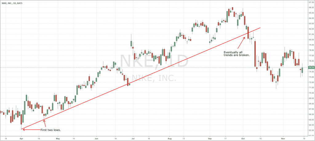
An uptrend joins at least two lows on a stock’s chart.
Generally, we look to connect the first two low points as a stock begins moving higher, and we can then reasonably expect further lows along the uptrend to reach the line.

However, with this Disney chart below, we can see that connecting the first two lows wouldn’t have given us a good picture of the uptrend. Once the chart has more time to develop it becomes clear that an uptrend is, in fact, in place, and we can get a better idea of where we might expect the next drop in the stock’s price to land.

There are no hard and fast rules for drawing a trendline. Sometimes, for a trendline to work, you might find you need to ignore a spike high or low, or that you’ll need to connect the first and third low instead of the first and second. How much importance to put on any particular trendline is up to you. Over time you’ll get better at judging whether a particular trendline is legitimate or not. The goal of a trendline is for you to spot potential areas for the stock to reverse direction, and when that doesn’t happen, it should help you recognize that something has changed in the stock’s behavior.
Again, the more points/lows that lie on your upward trendline, the more reliable an indicator it becomes for you.
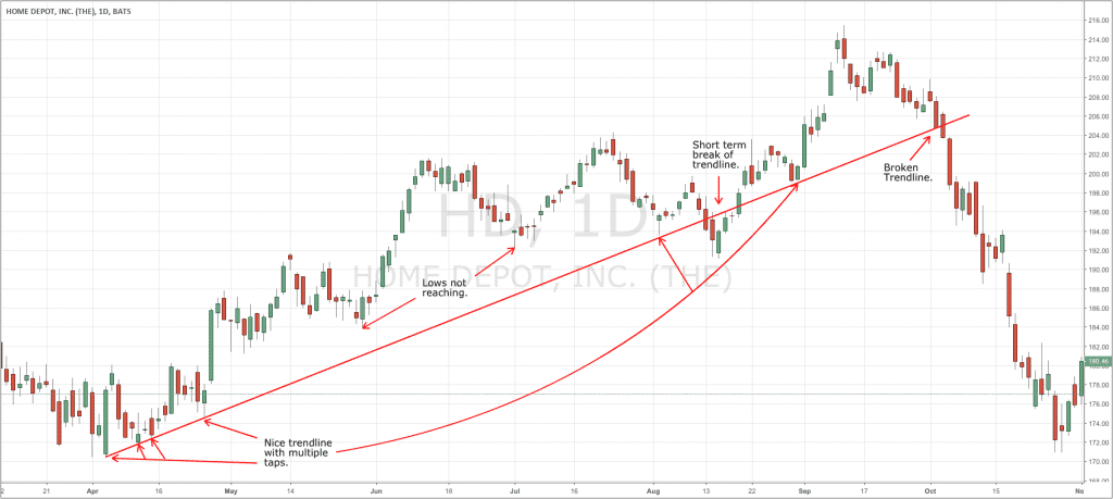
Here is a fairly typical trendline. In April, HD stock turned higher after a downtrend. In the first month, it tapped the new trendline four times, establishing a pretty nice base to build a trendline off of. Over the next couple of months, the stock rose and then dropped, approaching the trendline, but not quite reaching it. We then get a nice tap at the beginning of August, followed by a break of the trendline. Breaks like this are fairly common at some point—trendlines are not an exact science. In this case, the stock quickly recovered, then tapped the trendline yet again. After a nice five-month uptrend the stock finally rolled over and broke hard through the trendline, ending the uptrend and beginning a potential downtrend.

Downtrend
A downtrend joins at least two highs on a stock’s chart.
Everything else about the trendline is the same as it is with an uptrend, just flipped. You need two highs to construct your line. A third high really helps to confirm it.

In the below example of EEM, you can very clearly see the downtrend even though none of the points line up exactly. Even though they aren’t exact, if you were watching for a reversal at the line you’d be far more inclined to recognize when it happened.

So, trendlines are good—until they aren’t. They are an indicator and a useful tool for us to determine good levels to enter and exit trades, but they aren’t perfect. We use them to give us additional clues to where a stock might be headed and where it might turn around.

