What is the Relative Strength Index?
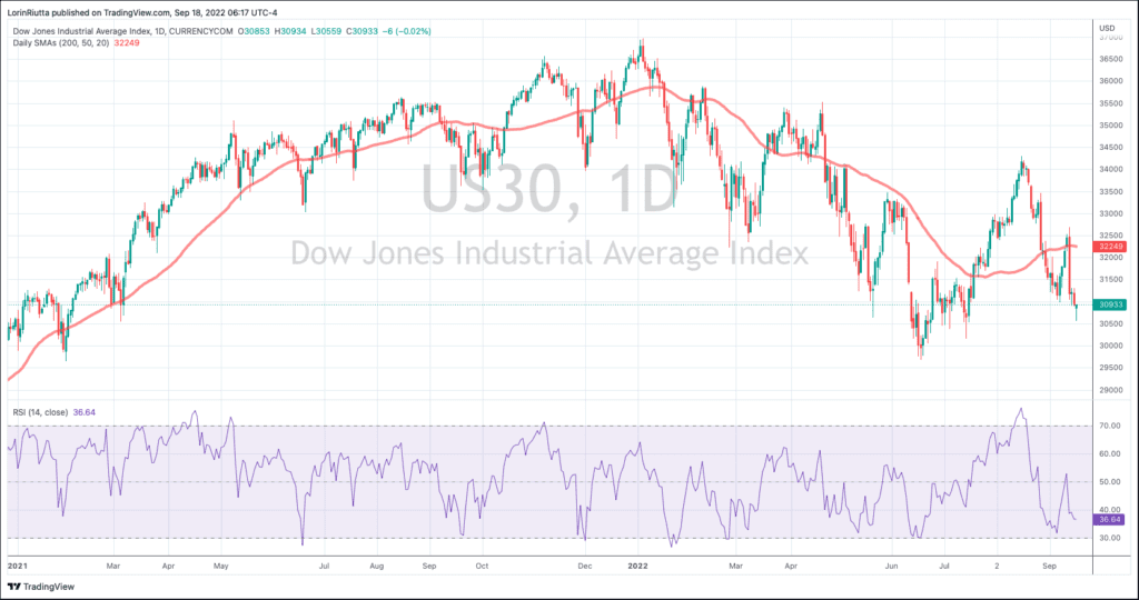
Do you want a technical definition, or do you just want to know how it can be useful? According to Investopedia, the relative strength index, (RSI) is a momentum indicator used in technical analysis. RSI measures the speed and magnitude of a stock's recent price change to evaluate overvalued and undervalued conditions in the price of that security. The RSI is displayed as an oscillator on a scale of zero to 100 with 0 being maximum oversold and 100 being maximum overbought. Typically, the RSI will be seen on the bottom of a price chart like shown here:
Notice the shaded area overs the values between 30-70. This is the "meat" of trading and where the price spends most of its time. Occasionally though, the RSI will rise or fall to an extreme and will print just outside of the shaded area. That is when conditions are reaching overbought or oversold extremes, and a reversal to the opposite direction is likely. Those are the areas we are most interested in when using the RSI indicator.
Traders generally consider a stock overbought when the RSI is above 70, and oversold below 30.
You can see how the highs and lows of the RSI coincide with the highs and lows of the stock price. Most of the time, both will oscillate up or down within a narrow band and not provide much information. Occasionally though, the RSI will diverge and not follow the stock price to the previous low. When that happens, it creates a bullish RSI divergence. You can think of an RSI divergence this way: The price of a stock revisits a previous low, but the RSI remains above the RSI level made during that previous low.
We talk about the Double-B trade here, but we left out the RSI in order to keep the focus on the price action. Here we will look at how we add RSI to the equation as an additional persuasive factor.
One of our favorite uses of the RSI is to look for divergences in double bottoms or tops. When a security tests a prior low, but does so with a positive RSI divergence, we typically take that as a bullish sign. Let's take a look at what that might look like on a chart.
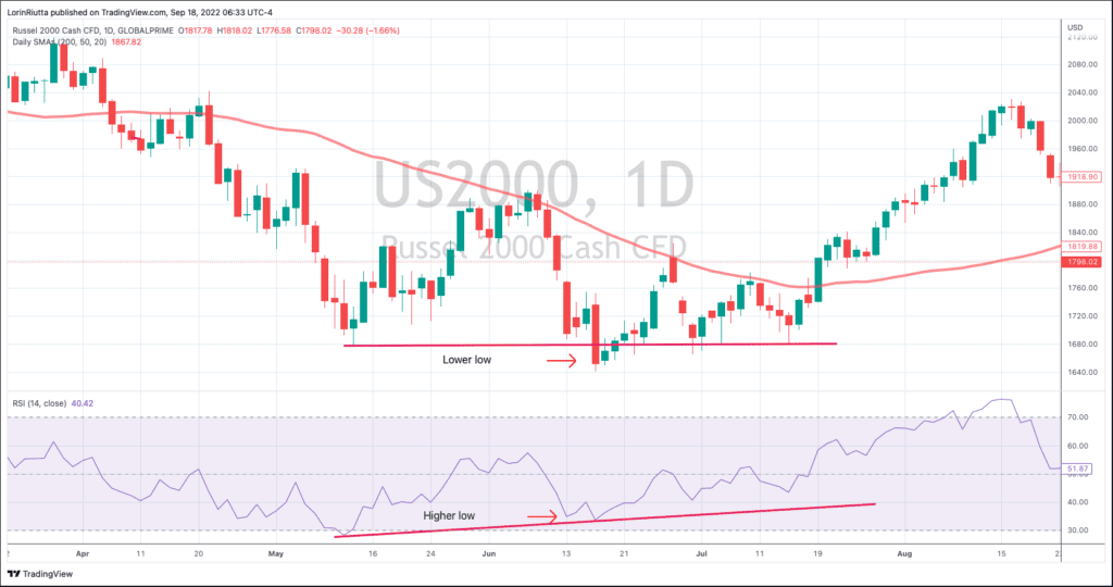
Notice in the chart that the Russell 2000 index made an initial low in May before rallying into the first half of June. It then declined again, and fell right back dow to the previous low, where it languished for several days. At that point, neither the bulls nor the bears could gain an upper hand, but notice the RSI made a higher low in June and then began to climb even when the price stagnated. We take that as a bullish indicator when we are looking to trade a Double-B like this.
A bearish RSI divergence works the same way, but in reverse. Let's take a look:
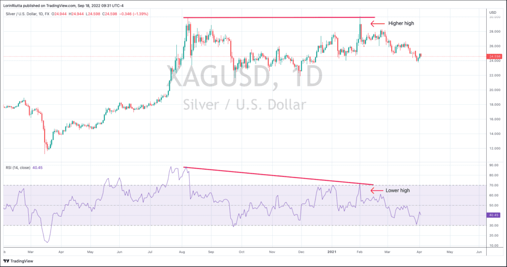
Here we can see a sharp rally that ended right at that $30 mark in early August. As a side note, it isn't uncommon for there to be reversals at big round numbers like $30 for silver. So, when we see the RSI reaching extremely overbought territory at the same time that the price is reaching a place of potential resistance, we become wary of a reversal. Sure enough, $30 proved to be too much for the bulls, and the price faded for a few months before once again approaching the $30 level in late December.
When looking at the price action alone, there was no way to know whether the breakout would hold, or if it was just a test of previous resistance. For added clues, we look at the RSI. Notice that on the initial surge higher, the RSI became extremely overbought, rising to almost 90. When the RSI is that high, a reversal is usually just around the corner. Following the pullback, the price drifted higher, and in early February it spiked slightly above its August high. That looked like a potential breakout, but one look at the RSI showed the second surge did not have nearly the same level of energy that the initial surge had. If the price was unable to exceed the $30 mark when it was surging with energy, it is less likely to do so with a milder RSI. Unfortunately for the bulls, the RSI accurately predicted a double top rather than a successful breakout.
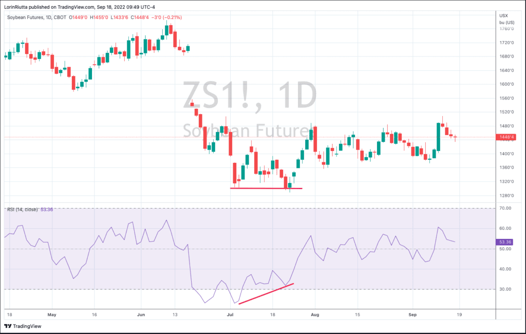
Here is another good example of the RSI correctly anticipating a false break down. With practice, you will be able to spot Double-B bottoms and tops at a glance. Those are potential trading setups. By adding the RSI to the equation, it can give you additional information that can sharpen your skills.
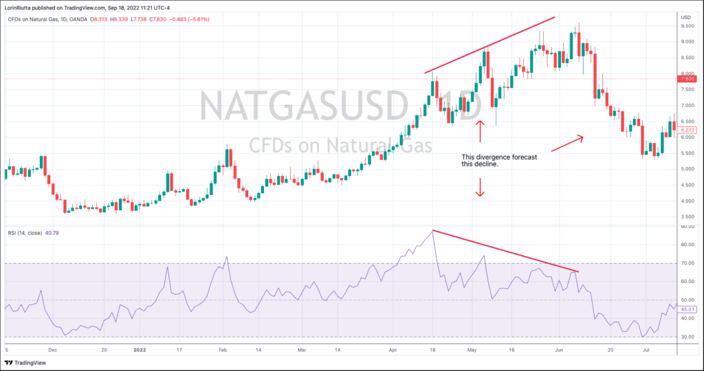
In addition to double tops and bottoms, we like to apply the RSI indicator to extended rallies or declines to see when it begins to diverge from the price action. When it does, we look at it as the beginning of the end of a trend. That is when the trend is beginning to tire and starts to lose momentum.
Here is an example of how the RSI began to seriously diverge from the price action. Notice each successive peak in the price was met with a lower peak in the RSI. Eventually, the RSI's warning that the trend was losing momentum bore fruit and the price fell sharply.
The RSI isn't infallible. It isn't accurate enough to be useful on its own. We would never buy a stock just because the RSI is rising or falling, but when used in conjunction with other tools in a trader's toolbox, it can be useful when it shows a divergence. So, the next time you find a sweet setup, add the RSI indicator to your due diligence and see if it supports the rest of your technical analysis.
Add RSI to TradingView Chart
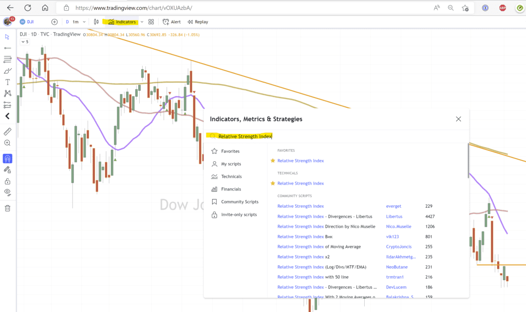
Adding the RSI to your TradingView chart is easy. Click the Indicators button at the top of the chart, search Relative Strength Index, and click the Star to make it a favorite so you can easily add or delete it in the future.
Keep Up With the Wanderer Crew No Matter Where We Are

Living and traveling on a boat means for a few months each year we have to wait out hurricane season. This year we are in Puerto Vallarta. As I write this it's extremely hot outside, and there is a tropical storm cruising past offshore, but Banderas Bay provides pretty much all the protection we need to avoid the worst of any nasty weather. Mexico is also an ideal digital nomad location. A beautiful country, friendly people, amazing food, fast internet, and great currency exchange for those working online and earning a living in USD or Euros.
Ready to Learn & Explore More?
If you haven't done so already, it's a great time to subscribe. Whatever your dreams for a Wandering life include, the shortest path to finding them starts right here. You don't have to do it the hard way by learning on your own and making costly mistakes. The financial education and professional trading strategies alone are worth the cost of an annual subscription. But when you add in the guidance and advice shared by hundreds of experienced Wanderers who are already living a SELF-dependent, pretired life–now that is truly priceless.
The world is waiting. Join us and hundreds of successful Wanderers and subscribe today.


